previewing a Low-Key Hillclimbs kit design with Pro Cycling Manager
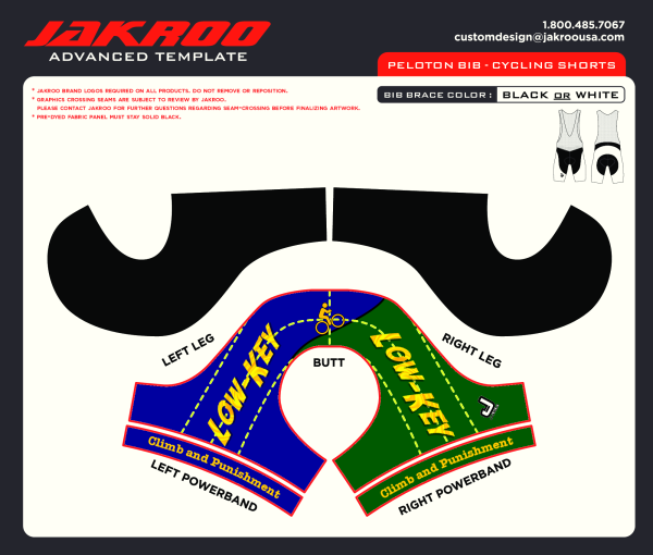
I was working on a jersey design for Low-Key Hillclimbs using a mixture of template files which correspond to pieces of fabric. The templates are good because they have a roughly 1:1 correspondence to fabric area and are thus a good reference for the jersey art department to render final artwork which will be printed on actual fabric.
I used a combination of templates: a jersey template from Voler and a shorts template from Jakroo. I really like Jakroo since they have good quality stuff available in a great range of sizes with pricing which forgiving to low-quantity orders. Indeed their small "slim-cut" jersey fits me great: no excess but comfortable, exactly what you want for a racing jersey where "excess" equals needless wind resistance. Additionally, unlike Voler's version, I find the pockets a useful size. I love my Jakroo WeightWeenies kit I received as a gift.
Here's some designs I came up with for Low-Key (the kit info page is here). I did these by converting the PDF template files into PNG files with ImageMagick and doing art on them with Gimp:
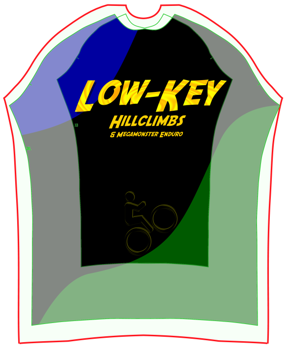
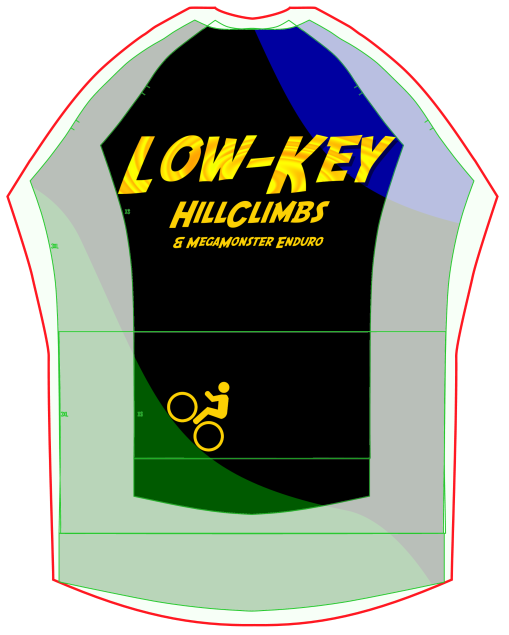
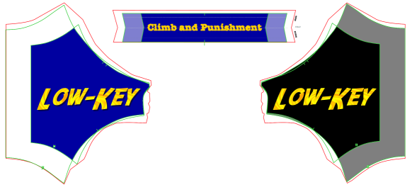
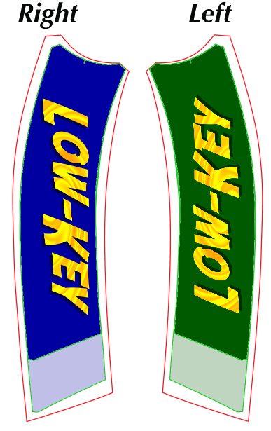
It's a bit of a puzzle putting all of these pieces together, and there's a real benefit to seeing them assembled. For that I went to a video game I've never played, Pro Cycling Manager. PCM has some fantastic rendered graphics of cyclists and bike racing. Of particular is their rendering of cycling kits: with the game, you can create custom stuff and it will be rendered on the riders. That's not only jerseys, but helmets, gloves, shoes, bike frames, and wheels, among other things.
I don't have the game, but a nice thing about the game is there's an old previewer for jersey designs. You just need to provide it a design.
For that, fans of the game provide templates via the game forums. Here's a template I used (click on image for full resolution):

I then processed this template, again with Gimp, transferring the graphics from my designs to this. Here's that result. Again click on the image for full resolution:
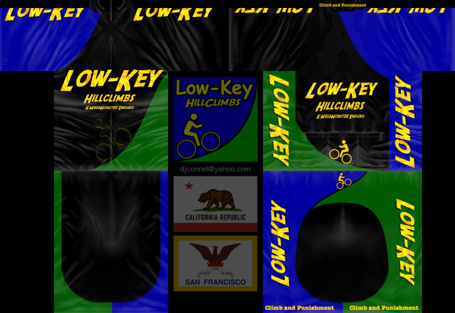
Not all of this is rendered. The flags, for example, are in wasted space. Also you can see there's geometrical distortion due to the need to wrap the flat image around a 3-dimensional human model. The frontal portion of the shorts, for example, reveal a clearly amplified topological feature.
Generating this image is nontrivial. For example, the logos on the shoulders are split between the front and the back. This requires to-the-pixel alignment of these portions to make sure there's no registration error in how these are joined. That said, there's still major distortion here, as you'll see.
To see the 3-dimensional image, I needed the following steps:
- Install the Unity 3D player (Mac or Windows)
- Go to the PCM shirt viewer
- Paste the URL of the above image into the window: http://lowkeyhillclimbs.com/2014/jersey/PCM_LKHC2014.png
- Hit "load texture"
- Make sure to try the "animate" button
On my Mac, the viewer installed on Safari, not Chrome, which I normally use. But on Safari it ran fine.
Some screen shots are here. Note the distortion in the shoulders and at various points of relative topological complexity:
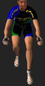
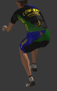
If I actually wanted people to use this jersey in the game, I'd need to be more careful, compensating for the topological distortions. Here's a design someone else did where this sort of compensation has been done:
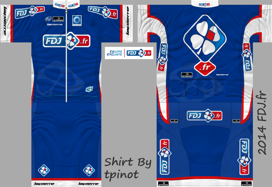
I think in most cases it's an interactive process where people do a design, then apply distortions to make the 3-dimensional rendering look good from all angles.
I look forward to moving forward with the Low-Key Hillclimbs order. I've sent Jakroo my art and look forward to what they get back to me with. They have their own 3-d rendering software which does a good job of showing how their designs will look on an human body, although it lacks the dynamic aspect of the Pro Cycling Manager viewer.

Comments