Jersey designs I've done on Pro Cycling Manager templates
Last time I wrote about my Low-Key jersey design, which I previewed with the Pro Cycling Manager "shirt" 3-D viewer.
I've used this before for various jersey designs I've done. Most are based on the 2009 Pro Cycling Manager templates, which are half the resolution of the 2013 standard. However, they all work fine on the previewer and, I assume, the actual game.
Here's a summary.
Broccoli Man
This was a fun design based on a "superhero" who featured in some on-line videos a few years ago.

Metrigear
I was a big fan of Metrigear, and I did this design based on the art on their website. They were since bought out by Garmin, who already has a great jersey design with their pro team.

Team Roaring Mouse
This is my bike racing team. I did a design proposal for the team. The proposal was rejected, which was a disappointment, but the design that was chosen turned out to look really good.

Weight Weenies
Of the designs shown here, this is the only one which was printed. The first of the listed designs was the one which got produced. I had one, but the ultralight Louis Garneau fabric didn't stand up to safety pins, and it developed shreds which make it virtually unwearable now. Later another, related design was done for the WeightWeenies forum, produced by Jakroo, and I really like that one.
The designs shown here investigated different color options.


Low-Key Hillclimbs, version 1
I had done this earlier version of a Low-Key Hillclimbs jersey. I was pleased with it in some ways, but the bright colors and Comic Sans Serif font make for something which I don't think works as well for a jersey people might not have wanted to wear. I'm much happier with the latest design. The theme was an impossibly steep green hill with a blue sky and a yellow cyclist boldly riding the hill, unconcerned about the vertical grades which follow.

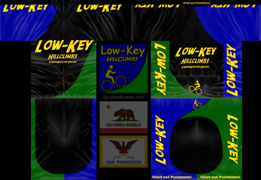
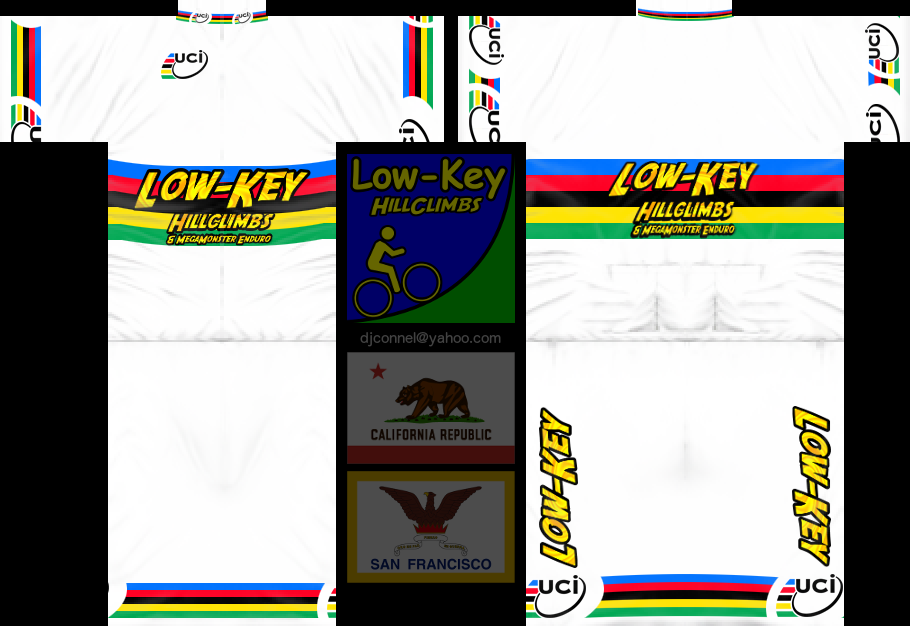
Low-Key Hillclimbs, version 2
This is the design I described last time. I went for darker colors, darkening the green and blue, then introducing a considerable black area between, representing the asphalt of the road. I made the cyclist on the front more subtle to avoid emphasizing curves on the front of the body. I also got rid of the Comic Sans Serif font (a friend once tweeted "Never use Comic Sans"). This is the first design I've done with resolution to the 2013 standard.
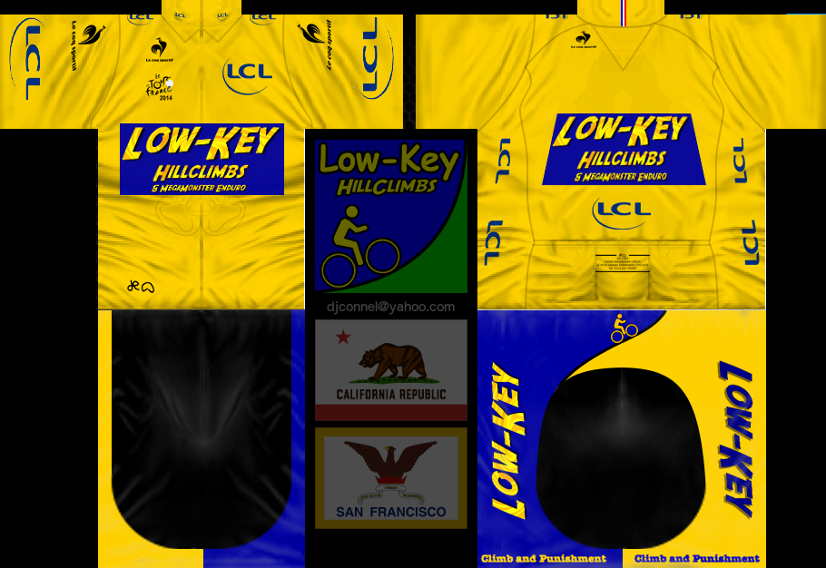
And then there's this I threw together quickly using a yellow jersey design from the PCM forum:
And, of course...
And for completeness:
But then because I just can't get enough:
The last few of these were added after the original blog post. This stuff is addictive. It's a good thing I've not tried the game.
Synopsys
Here's a design I quickly did using some graphics from Synopsys. I liked the purple Earth pattern so wanted to see how it would look on a jersey. I've iterated this more than I'd like to admit to myself since I originally posted it here, but I like the design now. Of course this design is not endorsed by the company: it's just me experimenting with company logos. Initially the background graphics were more prominent but I tempered them by adding solid side-panels and reducing the contrast where the graphics remain.

Viewing the jerseys in 3D
I'll repeat from last time the steps to view these jerseys with the PCM "shirt previewer":
- Install the Unity 3D player (Mac or Windows)
- Go to the PCM shirt viewer
- Paste the URL of the above image into the window, for example for the new Low-Key design: http://lowkeyhillclimbs.com/2014/jersey/PCM_LKHC2014.png
- Hit "load texture"
- Make sure to try the "animate" button


Comments