CIM: finish statistics 2000-2012
My races this year have been a series of just-missing goals, then rationalizing why conditions were such that under "normal" circumstances I could have met them. I'm not very happy with that: goals are goals, they are not conditional upon the best-case scenario, and in the case of CIM my initial goal was 3:15, with a back-up of 3:25 and a "reach" goal of 3:10.
However, when conditions were for strong rains and heavy southern winds, I honestly had to let these goals slip a bit: it was enough just to motivate myself to set off in these rather epic conditions, let alone pulling off some sort of target time in what was my first-ever road marathon. Part of the negotiation process was, "okay, I'll do the race, but don't try and tell me I failed because I was too slow."
Despite this, once I got going I felt good, and the conditions while arguably slower didn't feel particularly bad. I say that as I sit here recovering from a cold which I "somehow" picked up in the days immediately after the race. But I was so worried about how bad it would be, when I was in it it simply wasn't a problem.
But I love statistics, so I can't resist looking at the numbers. MarathonGuide publishes the mean and standard deviation of times for marathons over the years. I wish it was easy to access the full-data, for more detailed analysis, but my first attempt to mind their data failed, so for now I'll go with these aggregate statistics. The problem with aggregate stats is there are confounders. For example, women are slower than men, so if more women run one year, the average will be lower: that's not slower conditions, that's simply a shift in populations.
But here's what I get. I plot the mean finish time per year as a circle, with ±1 standard deviation as bars. The net average for 2000-2010 is an orange line, with the yellow band indicating the standard deviation of these annual averages. I'll explain the rest after the plot:
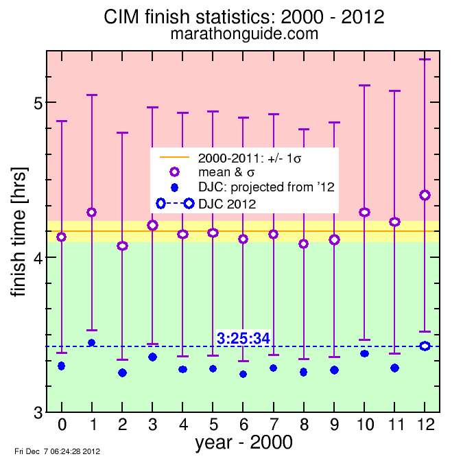
One thing is immediately evident: 2012 was a slow year. The violet circle, indicating the mean time, is the slowest of all 13 years plotted, falling well above the yellow band. If I look at times one standard deviation faster, 2012 actually is not the slowest year, but is in a virtual tie with 2001. This is because the standard deviation was greater for 2012. Part of the issue here is marathon guide uses standard deviation of time, implying time is normally distributed, while I would have used standard deviation of the logarithm of time, since time clearly is not normally distributed since negative times are impossible and the normal distribution assumes all values are possible. The logarithm of time suggests it is fractional differences in time, rather than absolute differences in time, which are more significant (for example, the difference between 5:20 and 5:25 is different than the difference between 2:11 and 2:06. I think you would agree.) But this is a small digression. It's clear 2012 was slow.
I plotted my 2012 finish time as a blue circle with a horizontal dashed line. You can see for 2012 my time was outside the bars, while for all other years except 2001, 2003, and 2010 my time was inside the bars. This indicates my placing in those other years with the same time would have been worse. I find it more credible to conclude my relative placing would have been closer to constant, my speed different, rather than assume my speed the same and my placing worse in other years, since conditions affect the result. However, one could argue the differences in speed were because runners those years ran better or worse, and my time would have been more constant. For example. Actually "ran worse" is an unfair term. It's possible various factors resulted in a selection bias, for example more women or older runners or fewer top runners. But I'll just make the former assumption and see what happens.
So I concluded my position within the assumed normal distribution characterized by the given mean and standard deviation (sigma) would have been constant year-to-year.
Here is that result:
I indicate these times on the plot as solid blue circles
Except for 2001, 2003, and 2010 and My projected times come out fairly close to my 3:15 goal. And since I lost close to 5 minutes in the last 10 km alone, if I had run the same early pace in faster conditions, perhaps I would have been less worn out at the end and avoided this breakdown longer, which could have results in an even faster time. But "if", "if", "if". What matters is to actually run it.


Comments