history of Low-Key Hillclimb banners
I've been organizing the Low-Key Hillclimbs, with one extended break, since 1995, and as a cycling event it has always has always had its existence firmly planted in the internet. It was relatively early in that regard.
Web design hasn't really help up with the times, however. The pages are relatively simple HTML, although I indulged in some JavaScript in 1997, even with on-line ordering for T-shirts. I've only recently started using PHP, and only for Strava API interaction. I want to move toward more PHP in the future, but for now the HTML works fine.
One feature of every year is a banner image. Banner images are rather dated these days, but I still like them. Here's a brief history of the Low-Key Hillclimbs banner image. One note: the 1995-1998 pages were reconstructed, since they had been inadvertently lost. 1995-1997 were regenerated with original graphics, but 1998 was generated fresh in 2008 from 1998 result data. So the 1998 banner image is circa ten years later.
1995: Rendered with a crude X11 paint program, using silouette of Marco Pantani
 |
1996: Bolder font, tightened, but otherwise similar
 |
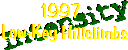
1997: Intensity was the theme (slight irony), against green background
 |
1998: Original web pages no longer available; this was basically a copy of 2008
 |
2006: The Comic Sans was supposed to represent Low-Key. I alpha-channeled year.
 |
2007: I scripted the year, and changed the text color
 |
2008: Copy of 2007
 |
2009: Another copy of 2007
 |
2010: I graded the text color and reduced opacity on year
 |
2011: New design, using a metallic text tutorial for Gimp
 |
2012: Copy from 2011; I actually coped and pasted 2nd 2
 |
2013: No "3" to copy, so new design: colors more plastic, with nova in background, using Gimp
 |
2014: Fun with Gimp render filters, Mt Hamilton paceline in background, and improved year placement
 |
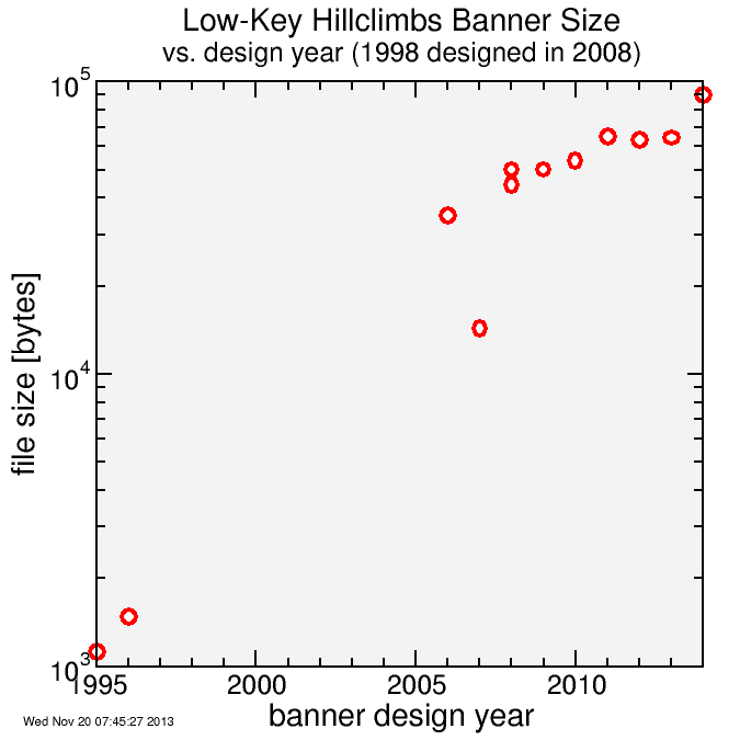
I am a big fan of compact file size, as I can't expect everyone to have maximum bandwidth 24/7. But of course file size budgets have increased over the years. 1995 was 4-bit GIF mapped to the Netscape Color Cube. By 2014, it's 24-bit color with 8-bit alpha channel. Still, compared to the vast majority of the web, the Low-Key pages are exceptionally compact. This policy paid off with the explosion of mobile device web access. I have no need for mobile versions of the Low-Key pages: they were already mobile-compatible.

The 2014 design I did yesterday afternoon on my train commute, and finished it off this morning sipping tea (decaf black, mixed with a protein-fiber-vitamin drink mix and a bit of Stevia... yum, yum). Every year I go into it thinking perhaps that year is the last year for Low-Key. Every year needs to have freshness, needs the support of my co-conspirators, and needs to address the key concerns of all involved in things which can be improved. Every year needs to be better than the one before.

Comments