Giro versus Tour distance
Last time I wrote a bit about the Giro 2011 route, more about the qualititative than the quantitative. The Giro route just recently announced for next year is brutal, that nobody denies. The striking feature is the incredible series of mountainous stages. But how does the distance stack up?
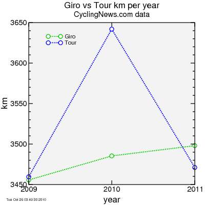
First I show data i took from CyclingNews for the Giro d'Italia and Tour de France for the last two years as well as for the announced 2011 routes. The Tour was a bit longer in 2010 than the Giro, but other than this one race, the Giro and Tour cover essentially the same amount of total ground: close to 3500 km over a three-week race.
I look a bit closer at these data in the next plot. On the lateral axis is the day of the race from 1 (the first day) to 23 (the final stage). On the vertical axis is the number of km covered by the race to the end of that day. The Giro is plotted in green while the Tour is in blue.
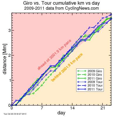
First comment: neglecting the longer Tour in 2010, the Giro has been a bit longer than the Tour going into the final stage. Each of these three years, the Giro has ended in a relatively short time trial, while the Tour has ended in what basically amounts to a promenade to the streets of Paris followed by a few "hot laps" of the Champs. Essentially the Giro goes into the final stage with more km, then instead of an "easy" day, the riders are on the rivet for the few km assigned to that last stage. So I feel giving the Tour credit for the longer race in 2010, they come out fairly even here.
The 2010 Giro is particularly interesting; after an opening three stages in Holland, there was an early rest day followed by a short individual time trial. This set the race "behind schedule". But after the time trial it set out on an ambitious schedule to catch back up, including a six-day stretch of stages over 200 km, one at 262 km and the final two finishing with brutally steep climbs: Monte Grappa and the mighty Zoncolan.
So in summary over the past three years the Giro route has been at least the equal of the Tour route. But what about historical trends?
I don't have data for the Giro. But Memoire du Cyclisme provides data for the Tour de France (Giro is subscription only and I've not subscribed yet, although 15€ for the full history data for the Giro seems like a great deal, so I'll do that now). I did my best to data-mine the HTML on the web site, adding up the distances extracted from loosly-formatted HTML, but it's possible I made some mistakes. With that caveat, I plot the Tour stage distance versus year here:
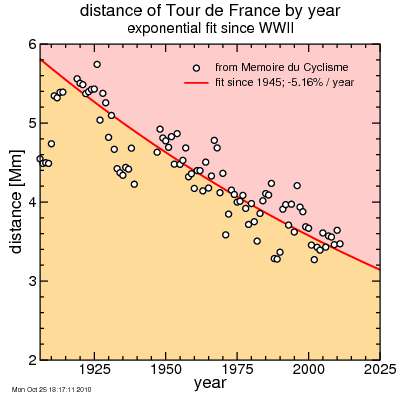
Obviously the Tour was strongly affected by the world wars. So I used only post-WWII data for my analytic fit. The trend is for a decrease in total distance of approximately 5% per year. Curiously this trend also captures the distances during the post-WWI period as well, even though those data are ignored.
Looking more closely at the data, the distance hasn't been in steady decline. It tends to hold a certain distance, then a policy decision drops it suddenly, then it holds for awhile, etc. It dropped precipitously in the late 1980's, then recovered in the 1990's, but then dropped again around 2000. It's held at around 3500 km/year since. There's been talk of the Grand Tours dropping to two weeks due to the crowded UCI schedule. That would obviously see a profound drop in distance. But it's not hard to imagine the Tour dropping substantially in distance, even with the present 23 day schedule.
But I hope that doesn't happen. I love the epic nature of these races. The Giro route for next year is just a reaffirmation of the tradition of these grand events.
First I show data i took from CyclingNews for the Giro d'Italia and Tour de France for the last two years as well as for the announced 2011 routes. The Tour was a bit longer in 2010 than the Giro, but other than this one race, the Giro and Tour cover essentially the same amount of total ground: close to 3500 km over a three-week race.
I look a bit closer at these data in the next plot. On the lateral axis is the day of the race from 1 (the first day) to 23 (the final stage). On the vertical axis is the number of km covered by the race to the end of that day. The Giro is plotted in green while the Tour is in blue.
First comment: neglecting the longer Tour in 2010, the Giro has been a bit longer than the Tour going into the final stage. Each of these three years, the Giro has ended in a relatively short time trial, while the Tour has ended in what basically amounts to a promenade to the streets of Paris followed by a few "hot laps" of the Champs. Essentially the Giro goes into the final stage with more km, then instead of an "easy" day, the riders are on the rivet for the few km assigned to that last stage. So I feel giving the Tour credit for the longer race in 2010, they come out fairly even here.
The 2010 Giro is particularly interesting; after an opening three stages in Holland, there was an early rest day followed by a short individual time trial. This set the race "behind schedule". But after the time trial it set out on an ambitious schedule to catch back up, including a six-day stretch of stages over 200 km, one at 262 km and the final two finishing with brutally steep climbs: Monte Grappa and the mighty Zoncolan.
So in summary over the past three years the Giro route has been at least the equal of the Tour route. But what about historical trends?
I don't have data for the Giro. But Memoire du Cyclisme provides data for the Tour de France (Giro is subscription only and I've not subscribed yet, although 15€ for the full history data for the Giro seems like a great deal, so I'll do that now). I did my best to data-mine the HTML on the web site, adding up the distances extracted from loosly-formatted HTML, but it's possible I made some mistakes. With that caveat, I plot the Tour stage distance versus year here:
Obviously the Tour was strongly affected by the world wars. So I used only post-WWII data for my analytic fit. The trend is for a decrease in total distance of approximately 5% per year. Curiously this trend also captures the distances during the post-WWI period as well, even though those data are ignored.
Looking more closely at the data, the distance hasn't been in steady decline. It tends to hold a certain distance, then a policy decision drops it suddenly, then it holds for awhile, etc. It dropped precipitously in the late 1980's, then recovered in the 1990's, but then dropped again around 2000. It's held at around 3500 km/year since. There's been talk of the Grand Tours dropping to two weeks due to the crowded UCI schedule. That would obviously see a profound drop in distance. But it's not hard to imagine the Tour dropping substantially in distance, even with the present 23 day schedule.
But I hope that doesn't happen. I love the epic nature of these races. The Giro route for next year is just a reaffirmation of the tradition of these grand events.


Comments