Chris Horner blood values compared with those of Lance Armstrong 2009
Chris Horner published his blood values on his web site. I didn't have much interest in this. Indeed, I was much more interested in the America's Cup then in the Vuelta. It's not because I'm not interested in bike racing. Rather it was because it all seemed so unreal, so "not normal", that I just wasn't interested. Horner won. Curious.
The data were published in raster form, and would require transcription (or OCR) to do anything interesting with. I didn't have the interest + time to do this. But then I saw this blog post which links to a spreadsheet with the transcribed data.
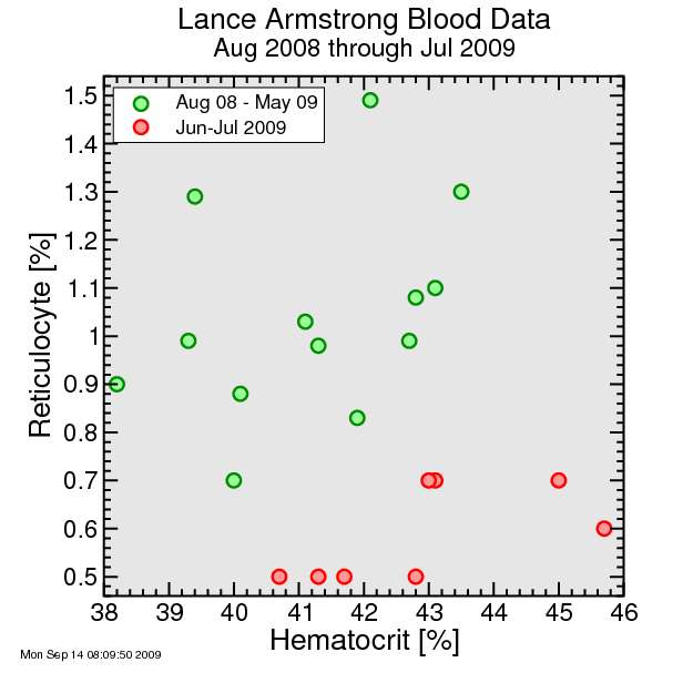
Back in 2009 I made the following plot, which I posted to my blog the following year, showing the reticulocyte percentage in Lance Armstrong's blood, which he published online, plotted versus his hematocrit. It's generally considered a sign of transfusion when the hematocrit increases with a low reticulocyte percentage. Reticulocytes are the young blood cells, and if you're producing your own, you'll have a mix of young and old cells typically. Lance's data fit into two clear groups, one with much lower reticulocyte percentage than the other for the same hematocrit. The low reticulocyte group happened to coincide with the Tour de France. This was suggested by Michael Ashedon and others to be highly suspicious. That the UCI failed to flag the data as suspicious was viewed as a sign it wasn't serious about catching high-profile dopers. Lance later said on Oprah he was clean during the 2009 Tour de France, and I'm not in a position to call him a liar. But then he also previously claimed he'd been clean his whole career.
So fast-forward to September 2013. Chris Horner posted his blood values, as I noted, and the obvious thing was to compare these to Lance's. Lance's data had just been for a half-year, however, while Horner's are for the history of his testing under the biological passport. So Horner's data are a mix of high-profile races and out-of-competition testing.
Here's the plot:
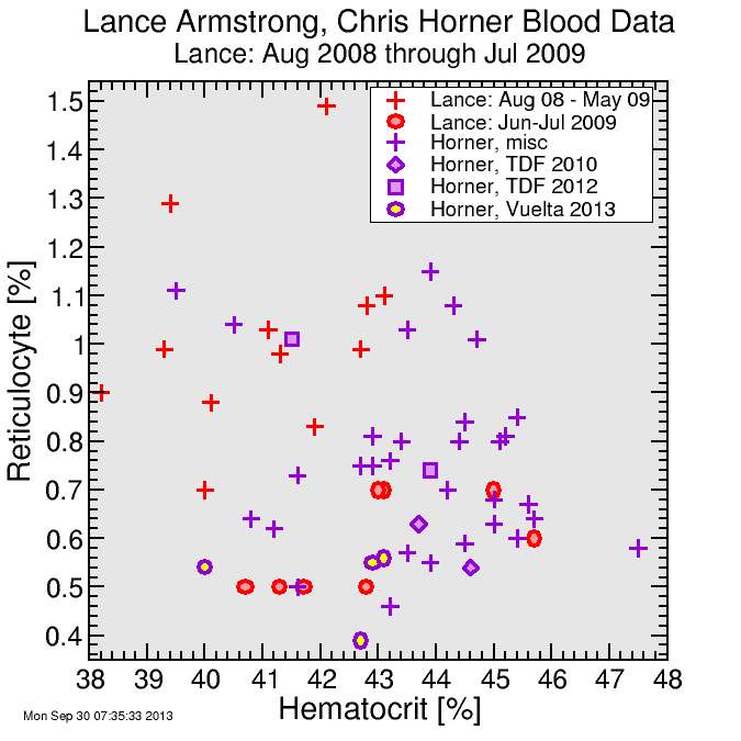
I split out three races from Horner's data: the 2010 Tour, the 2012 Tour, and the 2013 Vuelta. He rode excellently during all three, winning the Vuelta but against lesser competition than he faced in the Tour. So the question is: is there a clean signature of these races which suggest something's amiss? Certainly the data from the Vuelta this year and the 2010 Tour are right in the same zone as Lance's suspicious data from 2009, although the hematocrit doesn't extend quite as high. But the data from the 2012 Tour have a higher reticulocyte percentage.
Biological passport numbers are unfortunately sparse: it's hard to interpret differences between two big races. Certainly the story from Horner's data is not as compelling as was the story told by Lance's. But I certainly didn't see anything here which reduced the tepidity of my response to the race.
Anyone want to discuss the America's Cup?


Comments