Low-Key sticker design: revision
One day until my 50 km race... After my 12 day out-of-action following my oral surgery, then 4 days of running, then a last-week taper, I feel woefully fat and out of shape, and indeed I'm a solid 2 kg over my cycling "race weight". Some of this is probably leg muscle from running: my legs are looking a bit bigger. But that's not all of it. I definitely need to lose that weight before the Diablo hillclimb on 11 May.
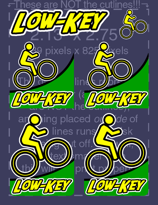
As a distraction, some sticker design revisions. First, I updated the square design to provide two options, one with a smaller cyclist, steeper hill, and squarer aspect. Then that freed room on the 2.13 inch by 2.75 inch template for a text sticker then additionally a cyclist-only sticker.

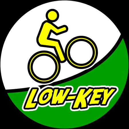
Then a design for a circular sticker. The black border is not part of the sticker. The "sky" is transparent: for some reason I'm not able here to use my usual trick of putting a colored table behind the transparent image to change the background.


Comments